Carbon38 Product Details Page

Project Brief
Carbon38 has been on the forefront of the athleisure trend, locking in 15 million dollars in funding from Footlocker in January. Despite its luxury branding, the website design was not consistent with Carbon38’s look and feel of its products. My job, as the sole UI/UX designer, was to elevate the Product Details Page, while making our customers feel catered to and special.
Human Goals
- Make the customers feel catered to
- Mitigate sizing issues and concerns of shopping online
- Provide styling services online (customer feels special)
KPI Goals
- Increase the add-to-cart click-through rate
- Increase UPT
- Increase the number of product discovery purchases
Desktop Design
Current Design

Re-Design

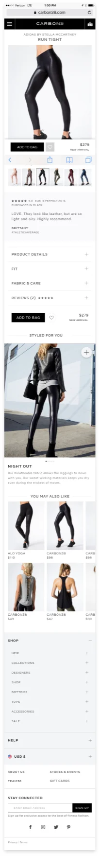
Mobile
Current Design

Re-Design
Complete the Look
Current Complete the Look Design

Currently, the "Complete the Look" features only one or two items on the left bottom corner of the PDP. It is 1) Very easy to miss and 2) Only allows room for up to two products to complete the look. There is no "Complete the Look" feature on mobile.
Redesign of "Complete the Look"


Interaction Concept


Re-Design "Complete the Look"
1) Allows Carbon38 to utilize the editorial photos that are already being shot for Social and Email campaigns. (More impactful ROI of editorial photos that cost significant amount of money(
2) Helps customers envision different outfits in one item.
3) Provides ease of use. If the customer likes on outfit, they may click on the plus sign to shop it right away.
4) Translates to mobile beautifully with the same functionality.
Mitigating Sizing Issues
Recommended Sizing


Showing Different Bodies
