
Sunnies Redesign

Context
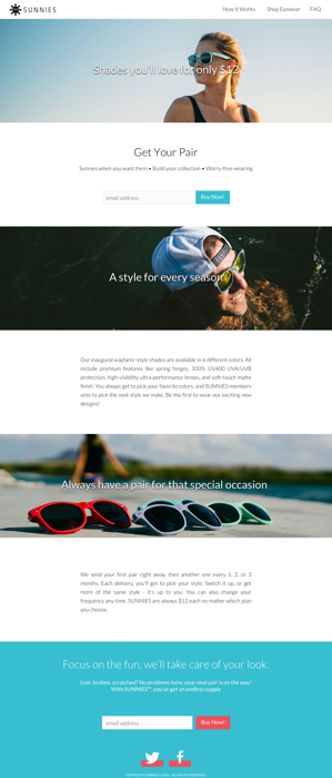
Sunnies is a subscription based e-commerce site that delivers sunglasses to subscribers every 1, 2, or 3 months.Priced set at only $12, Sunnies wants to disrupt one of the most overpriced marketplaces
Objectives
- Reduce bounce rate
- Identity & Increase KPI's: Site currently provides an anchor link to the product page, making it difficult to track KPI's and purchasing funnels
- Increase Sales
Challenges
- Customer's bias against online purchases: Roughly 75% of 112 surveyed stated they have never purchased sunglasses online; 8/8 Interviewees stated they would not purchase online.
Inital Site Audit and Main Goals

With initial view of the current site we wanted to improve two main facets:
1) Improve the design
2) Tell a better story
How do customers shop in-person?
Through a round of interviews and surveys, we learned that customers carry reservations about purchasing sunglass online.
Where do you typically purchase your sunglasses?

“ [I] NEVER purchase online because [I] can not try them on.”
- Lily
“I never purchase online because having to check the fit is very important. I can see stuff that looks cool and then once find them online, I will try them in-store.” - Jason
“I always purchase sunglasses in person. I’m not an online shopper.” - Taylor
Before starting to design, we observed in-person shopping behaviors of customers within the context of Sunnies' competitors (i.e. mall kiosks, H&M, Sunglass Hut). Their main habits we extrapolated:

Key Insights
- Shoppers view the sunglasses in multiple different views and angles to better gauge style and fit
- Shoppers depend on a second opinion to make their purchase
- Shoppers appreciate a separated pile they can easily refer back to make their final decisions
Suggestion
- Provide multiple angle photos of the sunglasses on and off models
- Embed a social media handle on the bottom of the site for social proofing and validation
- Add a "add to favorites" function where users can refer back to when deciding on the next pair of sunglasses
Current site and Recommendations
(Based on research and key insights)
Insight
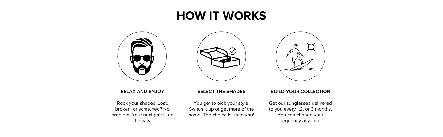
Confusion about the subscription service model insight. When we performed user testing of the current site with 5 participants, they need not realize that Sunnies was subscription based.
Suggestion
Limit the amount of text and explain through iconography

Insight
No value proposition. When we questioned our 5 participants for user testing, they perceived the quality of the sunglasses to be poor in the original website.
Suggestion
Provide high-quality photos and feature the quality points of Sunnies, such as 100% UV protection and spring hinges.

Insight
Difficulty gauging the fit of the sunglasses. Keeping in mind that most users had hesitations purchasing sunglasses online, gauging the fit would be very important to purchasing.
Suggestion
Provide a 180 degree view of sunglasses on both a male and female model.

Insight
8 out of the 8 participants we interviewed used "polarized" and "UV protection" interchangeably. Although state as important, participants did not understand the clear differences between polarized and un-polarized lenses. Because of the relatively steep extra charge of $7, we knew we needed to highlight attractive features of polarized lenses.
Suggestion
Upsell the polarized lenses by comparing the differences between regular lens and polarized lenses.
