
Project Brief
Caseology is an industry leader as top 10 seller on Amazon. My client wanted to build a loyal customer base on their Shopify site by capturing email and increasing membership. I re-organized the user flow and cleaned up the design for a better user experience.
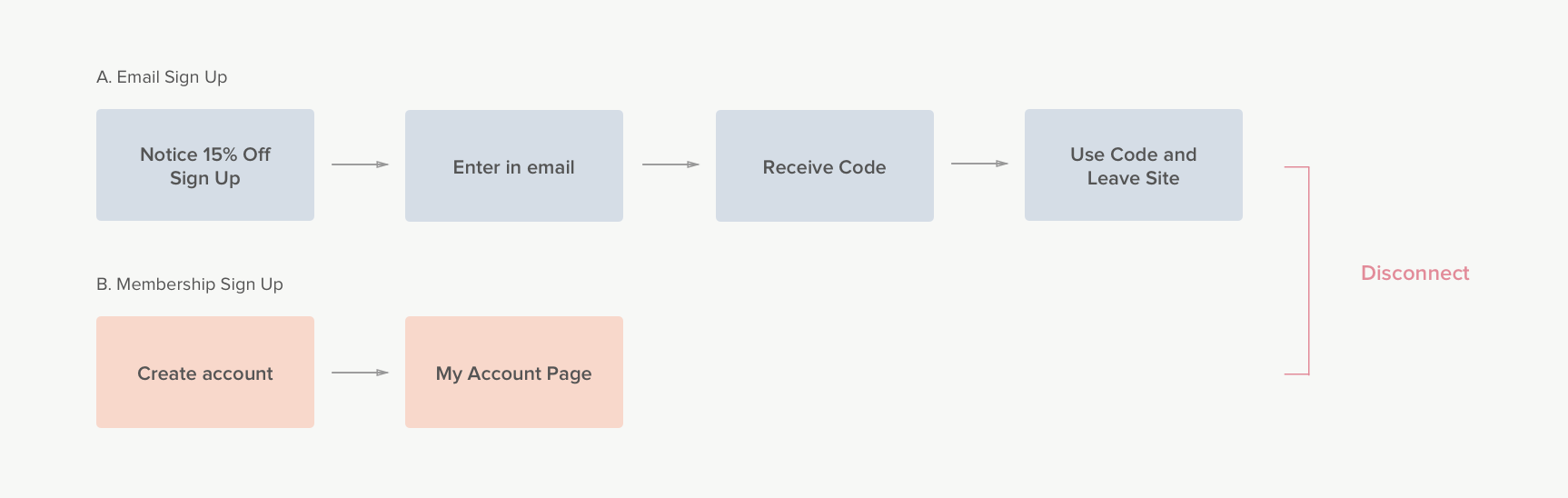
1. Finding the disconnect between email and membership sign up
The first problem I discovered was a disconnect between the email sign up and membership sign up. There is a 15% off code provided when users sign up for email listing but no incentive for a membership sign up. We were missing a critical opportunity to capture returning customers! The 15% off code itself showed to be an effective incentive as it was the number used code on Shopify. Realizing this, we combined the email and membership sign up so that we could capture more data about the user, understand them better, and provide more benefits after the initial 15% off code for the users.
By combining the experience it
- Gives users an initial incentive to sign up for membership
- Encourages users to return with membership benefits
- Provides an easier returning shopping experience with customer information saved
- Grants the company a better understanding of customer behavior and demographic
- Yields a better ROI for email marketing campaigns
2. Getting the Timing and Placing Right
Currently, the only place for an email sign up is on the footer and membership sign up is on the navigation. I wanted a more aggressive strategy to increase number of sign ups. By researching a number of other e-commerce site for inspiration, I sketched out a number of different areas the sign up could appear.

My teammates and I decided on Option D because attracted full attention to the 15% off incentive.
So, when should it pop-up?
I decide to have the Sign-up pop-up to appear on the Product Details Page, as a final push while the user deliberates on purchasing. I will also keep track of the exit-rate on the PDP page whether to see if the pop-up window will deter users from leaving the site.
3. Shortening the sign up process
I wanted to shorten the sign up process and avoid disrupting the users' shopping process. My second goal was to retrieve all necessary information from the user without burdening the user.


4. Refining the Content
Once we defined the flow, I focused on the content and visual design. My goal for the pop-up was 1) To create the visual attention to be around the 15% of incentive 2) Avoid visual clutter with social media sign up options

Along with my team, I decided that Option A would be the most compelling. I played around with featuring our phone cases in the pop-up window, but ultimately decided pictures would distract the attention away from the main incentive. Option A provides enough attention to the center field by highlighting the box with a color.
Final Hi-Fidelity Mockups for the Sign-Up Pop Up

5. Improving the Membership Account Page
The "My Account" page had largely been ignored due to other priorities on the site. Because of our new push for membership sign up, we knew our next target had to be the account page.
There was a slew of problems in these pages:
- Page was not optimal for mobile (a huge problem since 66% of our users come from mobile)
- Users had to go to a whole separate page just to edit
- Information was scattered everywhere ranging from addresses to past orders to Q&A
Previous My Account Page

To begin, I started off by organizing the information into 4 main categories: 1) Account; 2) Orders; 3) Addresses: 4) Billing. In order to separate the information, decided on the left tab format for web and a stagnant top tab for mobile. In the case for the account page, my teammates and I decided it was best to go in a standard format for user familiarity.
6. Hi-Fidelity Mockups for the "My Account" Page
Mobile


Web
